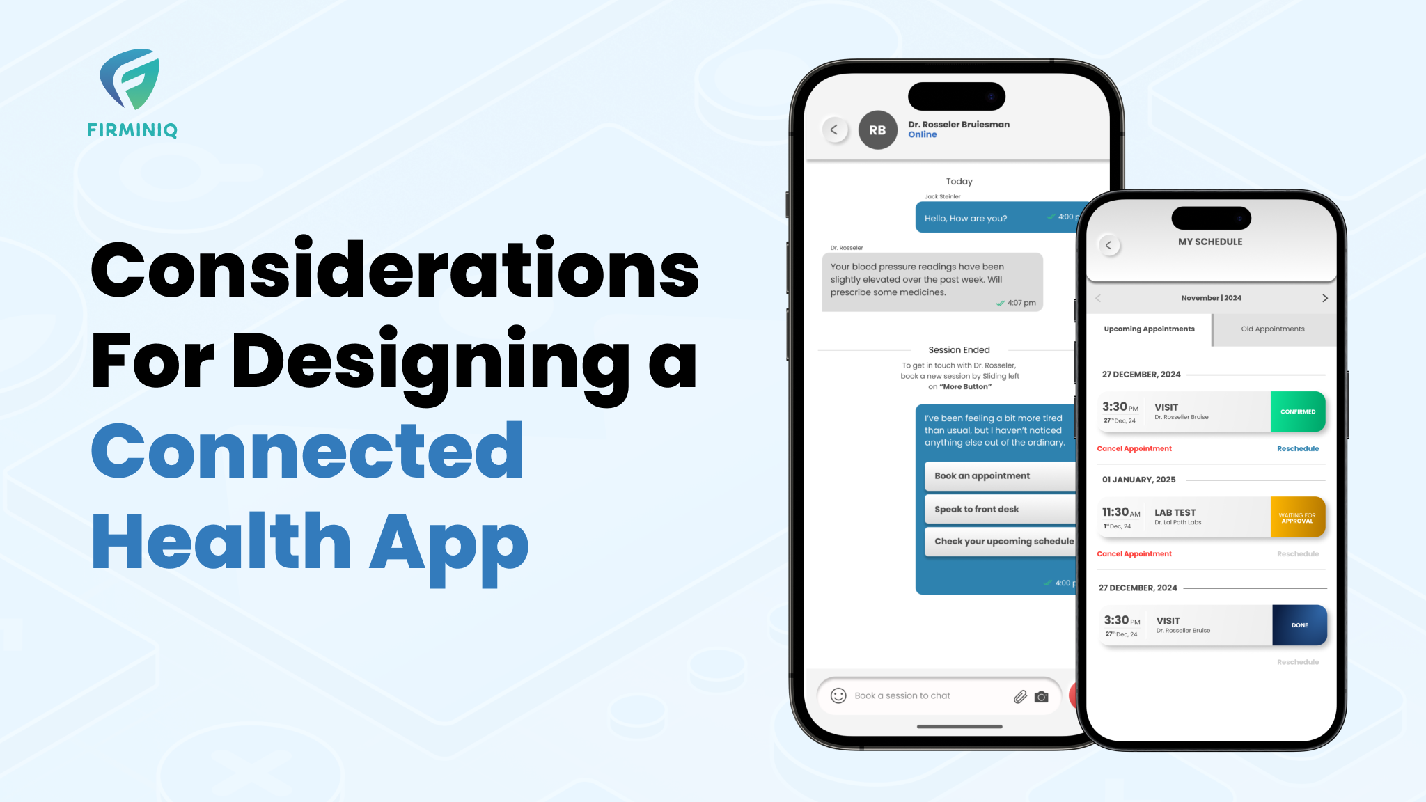
The connected healthcare app market is continuously growing, and there was a drastic need for such applications after the spread of the pandemic.
According to Zion Market Research, the global connected healthcare market had revenue growth of USD 51.49 billion in 2021 and is forecasted to reach nearly USD 296.55 billion by 2028, with a CAGR of approx. 27.9 percent over the forecast period. It encourages healthcare app development experts to cast around the most efficient solutions while making UI/UX design the cornerstone for success.
Well, a lot of such IoT applications already exist in the market, but it becomes vital to offer users unique, efficient, easy-to-navigate, and robust solutions that make them keep coming back. The app users come from diverse backgrounds and age groups (especially senior citizens), so it is crucial to focus on attributes like easy-to-use design, accessibility, security, and simplicity.
The blog offers detailed information about the top considerations you must follow while designing a connected health application to achieve a competitive edge.
Design Considerations that make your Connected Health Application Usable
Meeting all the patient’s and the physician’s requirements becomes a primary goal for the connected health app design. Here are some of the design considerations:
Meeting all the patient’s and the physician’s requirements becomes a primary goal for the connected health app design. Here are some of the design considerations:
1. Intuitive Navigation
End users must be able to clearly navigate through the platform and designers need to ensure a three-click rule. Users trying to find a particular service and scrolling it via different pages, is surely going to annoy them and they end up leaving!
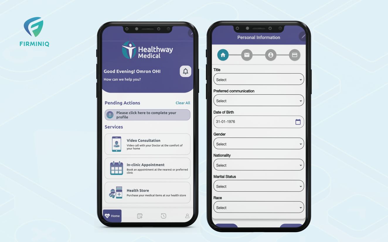
A connected health app needs to be multipurpose and easy to use, therefore the designers must place the crucial app functions on the homepage itself. HealthwayMedical is an example of a platform that promotes healthier lives with a straightforward design making navigation easy and quick for users of any age.
2. Ease of Use for All Type of Users
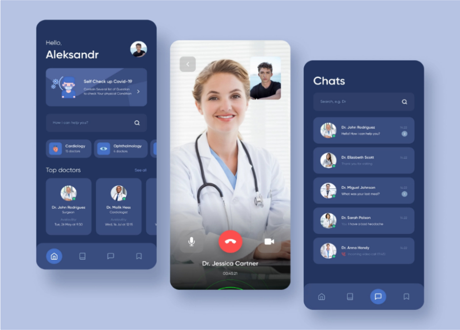
As referred above, people of different age groups use healthcare applications, and they may suffer from various illnesses as well. So, while focusing on the design of such applications, ensure to integrate intuitive icons with large, bold, and readable fonts.
With a simple-to-use interface, users who are not technology savvy can use the app easily. Here is an example of Jinga Life that connects patients with caregivers and depicts a clear layout for the end users to access it with ease.
3. Offer Features that are Designed to Serve Purpose
Any connected health app should offer only those features that are designed to serve a purpose and not because they are fancy. For example, If the patient is suffering from a chronic disease, the app should have all the necessary and intuitive features, it must be able to connect to the doctor seamlessly, able to quickly schedule the consultation, order medicines, and more.
4. Seamless Connectivity of Devices with the App
Connected health applications require seamless connectivity with wearables and other Bluetooth devices, so ensure the app supports multiple devices required to manage a chronic condition, there is no data loss during sync, can handle error scenarios, etc. It is also vital to ensure cloud synchronization for easy data accessibility by both the patients and the physicians. Cloud sync ensures scalability, accessibility and eliminates the risk of data loss.
5. Data Sharing with the Physician
Data sharing with the physician is a crucial component of connected health apps. The system collects the data and other vitals from the patients (sleeping conditions, heart rate, and more). Physicians should have direct access to the patient’s health data in real-time and their medical history as well. A secure API offers the simplest way to view and share patients’ data with the healthcare experts.
6. PDF/Printable Reports for Analysis
The patient report and vitals displayed on the app should be available in PDF and printable form to be easily shared with the physician.
7. Clear Error Messages
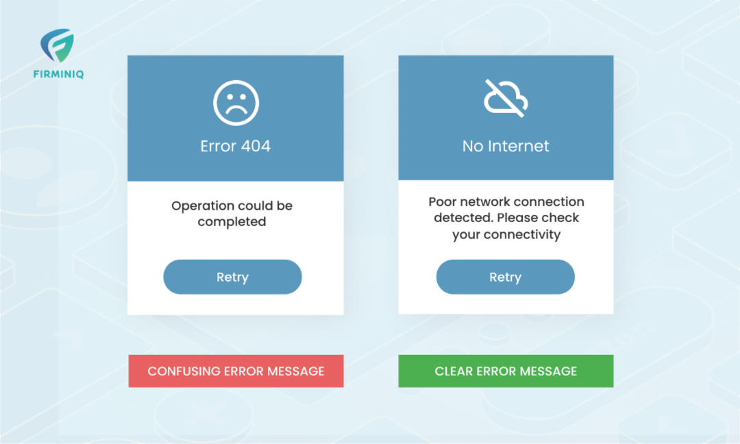
Connected health applications should clearly display the error messages. A clear explanation of the issues, explaining what the problem is, and offering necessary solutions including redirection, and support to the end user via mail or calling option will help maintain their sanity. With useful redirections and error message handling, it turns frustrating scenarios into pleasant ones.
8. Choose Color Scheme Wisely
Colors are incredibly important when we talk about healthcare platforms and must be chosen carefully by the designers. Blue and other neutral colors must be used that promote calmness, rather than dark colors that may provoke anxiety. The colors that may lead to fear including red, yellow, orange must be avoided.
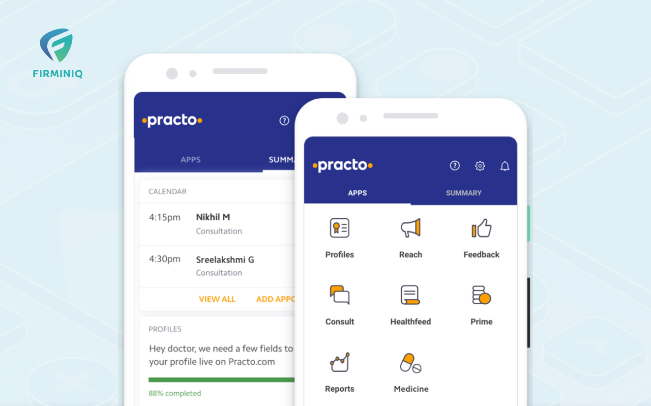
Colors are a strong point that conveys the right message via the application. It also tells the end users the kind of services they can use. Practo, an example of a healthcare app that connects with doctors around the globe, portrays how the use of calming colors like blue and white are soothing to the eyes of the user.
9. Personalization is the Key to Success
Personalization is one of the most marked design trends of recent years. In the world of customized solutions, healthcare apps are not left behind. Different users have unique needs and offering personalization is what keeps them happy and engaged. With usage analytics, you can predict the services that an end user will interact with based on interactions, items, and datasets. It also helps build an individual, customized patient journey and displays more of what you are interested in.
MDLIVE, a telehealth service provider, offers personalization to the user and here is an image that depicts the same.
10. Visual Insightful Reporting
Insightful reporting and analytics are essential components of any app that tracks data to create meaningful reports. It generates readable visuals important for the patients and doctors from the preprocessed sensor information. It allows patients to check the health performance measures on different parameters and offer the best experience possible. Doctors can monitor the health pattern of patients and understand their condition. Analysis should be displayed both manually and visually to accurately access the patient’s condition.
11. Sharing Health Data Privately with Family Members
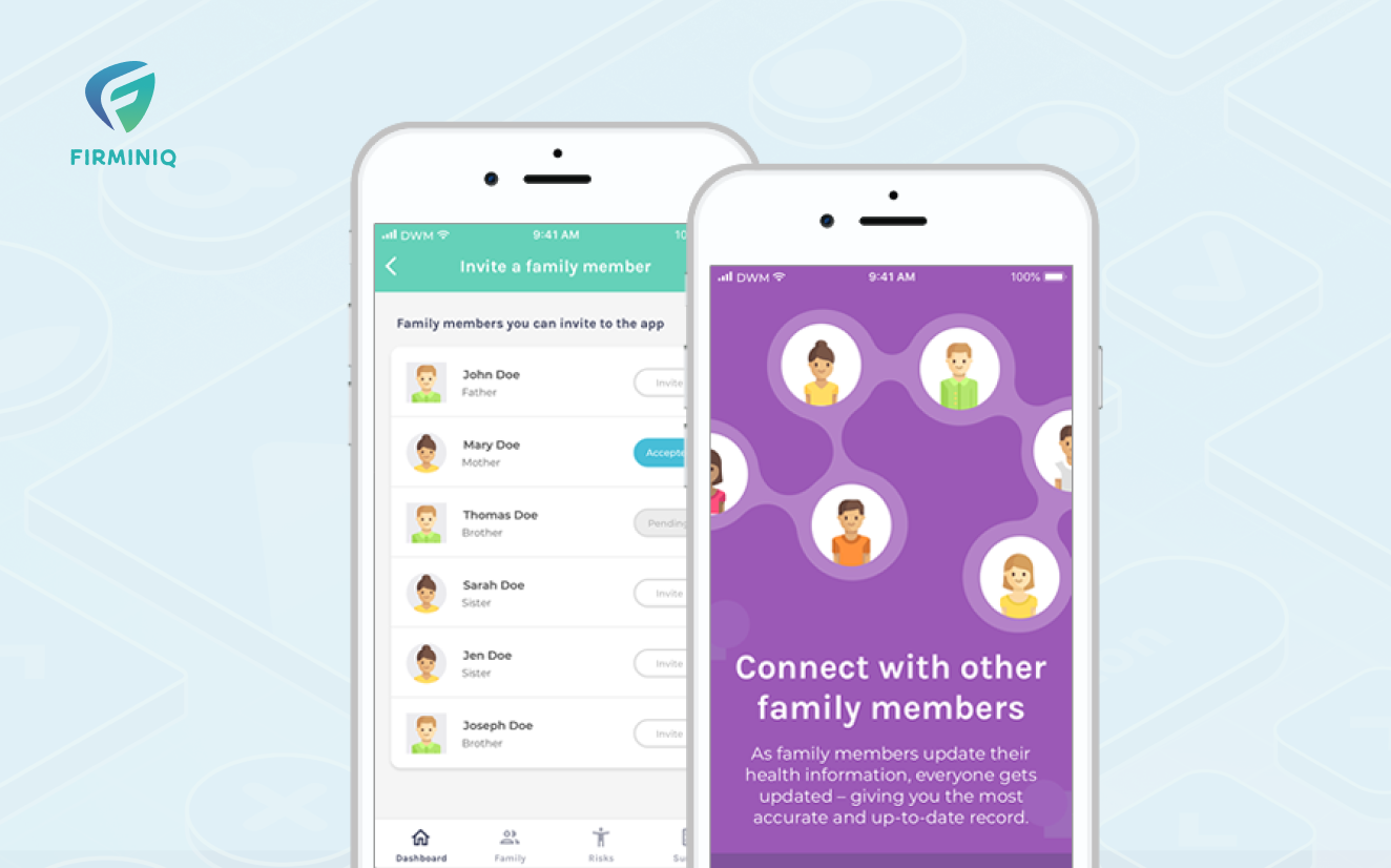
The app should have the option to share the patient’s information with one of the listed family members so that they are updated on the condition and able to prevent or lessen the risk to the patient’s life. The example of Famgenix, a platform to know your family health history, highlights how easy it is to share health vitals and information with family members to ensure the best care.
12. User Interface Compatible with Multiple Devices
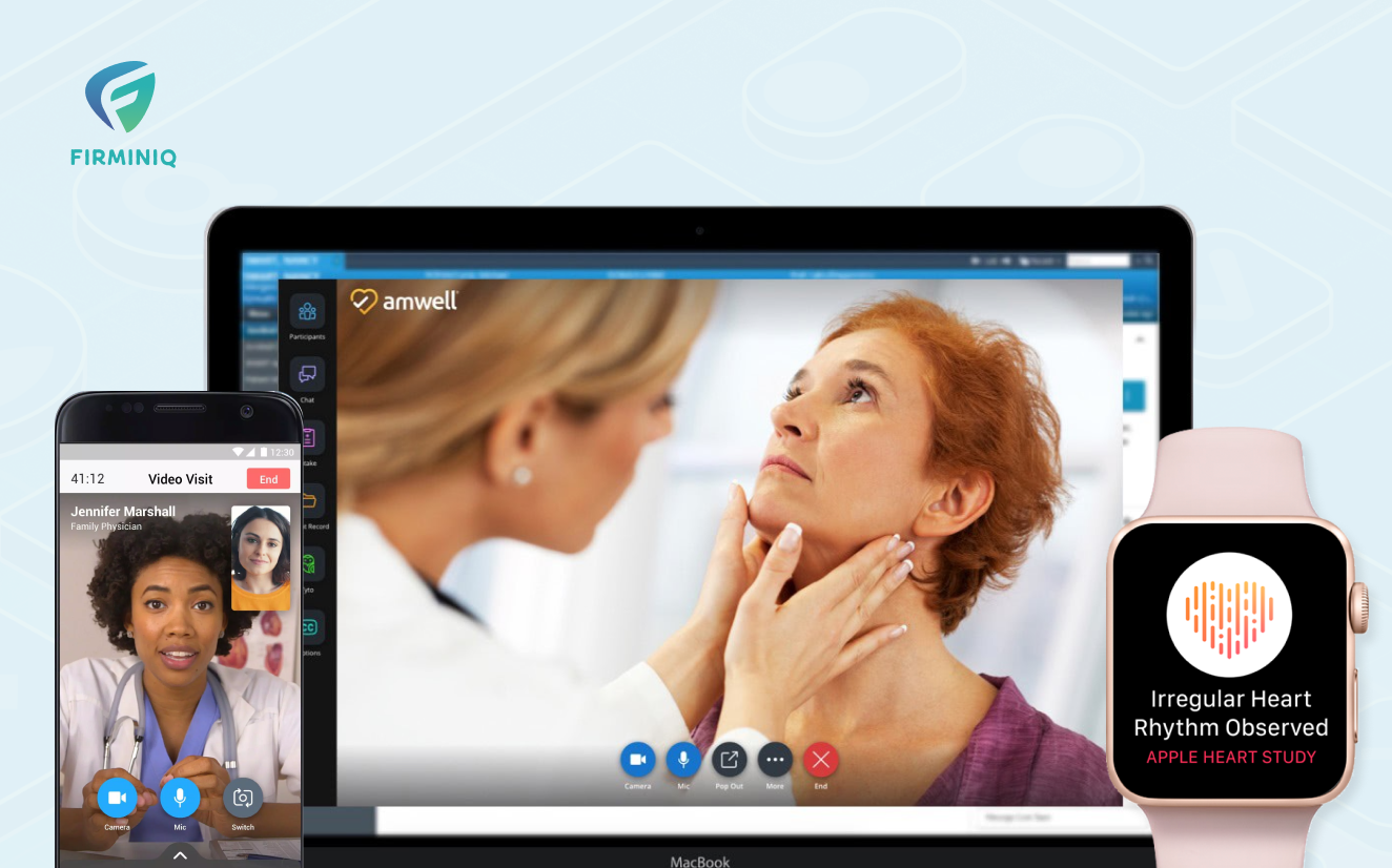
The app design should be accessible to be used on multiple devices and operating systems. Designing a multiplatform application including desktops, smartphones, tablets, and laptops ensures the creation of an effective healthcare experience where end users can freely access services on different platforms. Here is an example from Amwell, a leading platform connecting patients to the physicians, showing the app’s compatibility with multiple devices allowing the end users to determine its true potential.
13. Security and Privacy
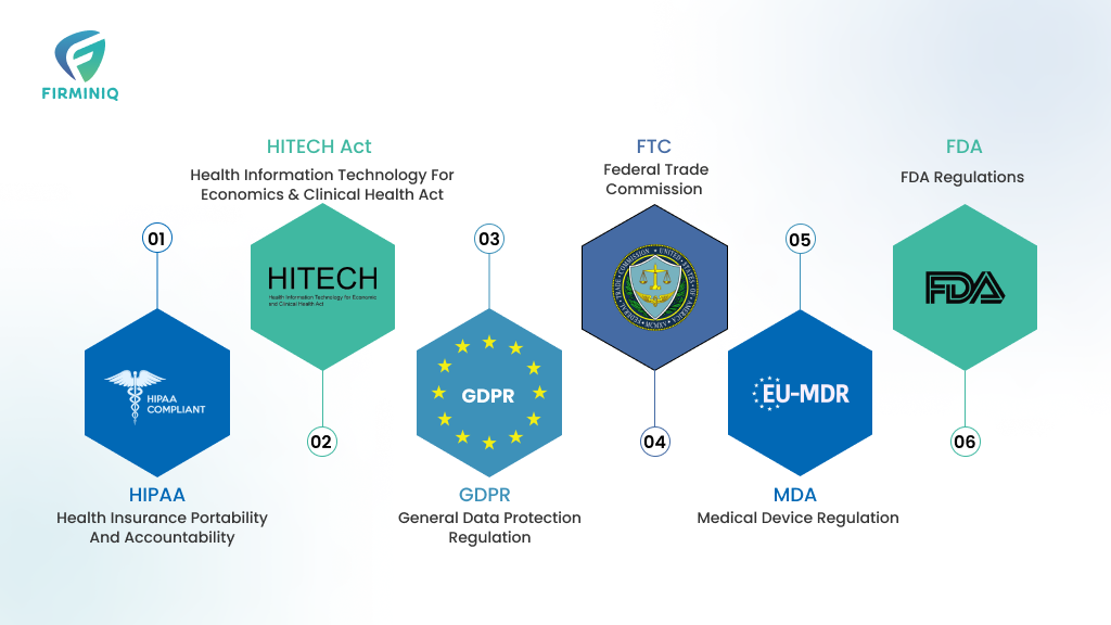
Connected health applications have sensitive data and vital patient information; therefore, their security is of utmost importance. Ensure designing an application with all the regulatory requirements (HIPAA compliant) to protect data and implement face recognition, PIN, and passwords for holistic risk mitigation.
Research by Global Kaspersky unveils that around 30% of the healthcare providers experienced bad cases where the personal information of their patients was compromised during the remote consultations making security a matter of concern.
14. Ease of Making Payment
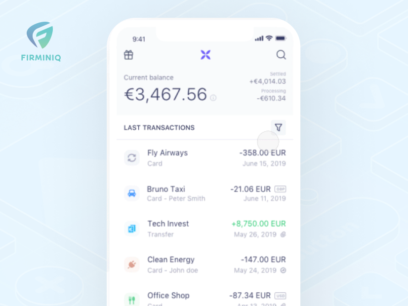
End-user expectations are essential for the success of a connected health application as it requires payments to multiple stakeholders, doctors, insurance companies, patients and more. Whether it is subscription based or payment based, it is vital to ensure it is made easy, and have multiple payment options done via a single click.
Referring to the above example from Amwell, a telehealth platform that connects patients with the best doctors and offers a seamless payment experience for the patients and increases their satisfaction.
Winding up!
Designing a connected health application may be a complicated task but proves to be fruitful if all the appropriate and above-mentioned steps are followed wisely. If you have any questions and want to know more about the most crucial aspects of UI/UX design for your connected healthcare app, do reach out to us!
Want to fulfill the end user’s needs and stay on the top of Google Play and App Store? Let us help!


